 by Emily
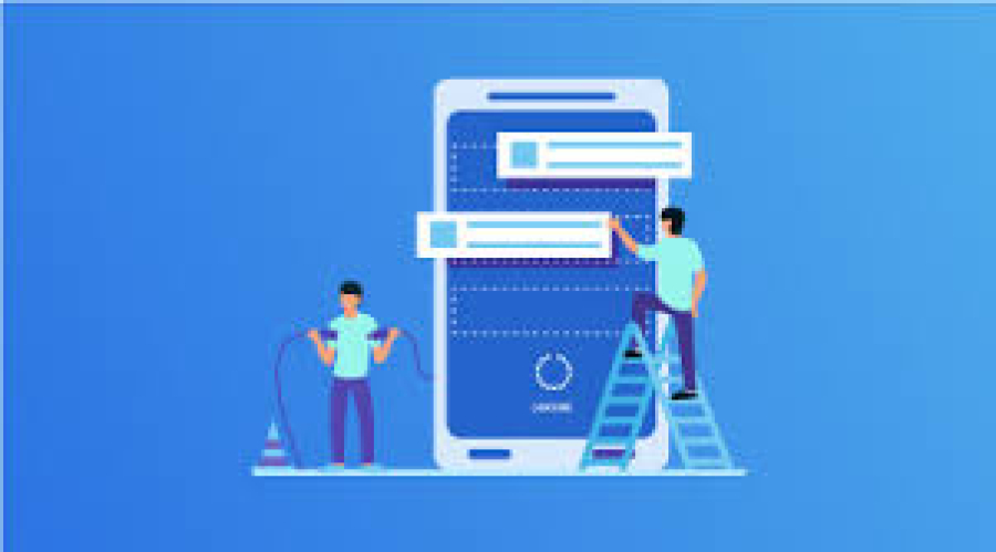
Tips for Designing a Mobile-First Website
With the surge in mobile internet usage worldwide, designing websites with a mobile-first approach has become essential for freelancers and businesses alike. Mobile-first design means crafting your website starting from the smallest screen—smartphones—and scaling up for tablets and desktops. This strategy not only improves user experience but also boosts SEO rankings, which is crucial for any freelancer or agency offering web design services. At FreelancerBridge, we emphasize empowering freelance designers with practical tips and strategies to master mobile-first web design, helping them deliver faster, more responsive, and user-friendly websites for their clients.
Long Description
1. What is Mobile-First Design?
Mobile-first design is the practice of designing your website for mobile devices first, then progressively enhancing the experience for larger screens.
This approach contrasts with traditional desktop-first design and addresses the reality that over half of global web traffic comes from mobile devices.
2. Why Mobile-First Design Matters for Freelancers
Improved User Experience: Mobile-first sites load faster and are easier to navigate on small screens, keeping visitors engaged.
Better SEO Performance: Google prioritizes mobile-friendly sites in search rankings, increasing visibility for your clients.
Competitive Edge: Many clients seek freelancers who understand current design best practices like mobile-first.
Future-Proof Design: Mobile-first ensures your designs remain relevant as mobile usage continues to grow.
3. Key Tips for Designing a Mobile-First Website
3.1 Start with a Simple Layout
Focus on clean, uncluttered layouts that prioritize essential content.
Use a single-column grid system for mobile screens to make content easy to read and navigate.
3.2 Optimize Navigation for Touchscreens
Design thumb-friendly buttons and menus that are easy to tap.
Use hamburger menus or bottom navigation bars for compact and intuitive mobile navigation.
3.3 Prioritize Content Hierarchy
Place the most important information “above the fold” to capture attention immediately.
Use headings, bullet points, and concise text to make scanning easier.
3.4 Use Responsive Images and Media
Implement images that automatically resize to fit different screen sizes without losing quality.
Compress images to reduce load time without sacrificing clarity.
3.5 Optimize Page Speed
Minimize CSS and JavaScript files and use asynchronous loading techniques.
Avoid heavy animations or unnecessary scripts that slow down the page.
3.6 Utilize Flexible Typography
Use relative font sizes (like ems or rems) that adapt smoothly to different screen sizes.
Ensure text remains legible on small screens by maintaining sufficient contrast and spacing.
3.7 Incorporate Mobile-Friendly Forms
Keep forms short and use input types suited for mobile keyboards (e.g., number pads for phone numbers).
Implement autofill and validation to improve the user experience.
3.8 Test Across Multiple Devices
Regularly test your design on various smartphones and tablets to identify usability issues.
Use browser developer tools and real device testing platforms like BrowserStack.
4. Common Challenges and How to Overcome Them
Balancing Functionality and Simplicity: Avoid cramming too much into the small screen; prioritize core features first.
Dealing with Limited Screen Space: Use collapsible sections, tabs, and progressive disclosure to manage content effectively.
Ensuring Consistent Branding: Maintain brand colors, fonts, and imagery while adapting the layout to mobile constraints.
5. Tools and Resources for Mobile-First Design
Design Tools: Figma, Sketch, Adobe XD for prototyping responsive mobile layouts.
Performance Testing: Google PageSpeed Insights, Lighthouse to optimize speed and mobile usability.
CSS Frameworks: Bootstrap, Tailwind CSS for responsive, mobile-first ready components.
6. Why Freelancers Should Master Mobile-First Design
Clients increasingly demand mobile-optimized websites due to growing mobile traffic.
Mastery of mobile-first principles enhances your portfolio and increases your value as a freelancer.
Mobile-first skills open doors to projects in eCommerce, blogs, portfolios, and corporate websites.
7. FreelancerBridge: Helping Freelancers Thrive
At FreelancerBridge, we provide freelancers with in-depth guides, tutorials, and tips like this to help sharpen your design skills. By understanding and implementing mobile-first design, you not only meet client expectations but also build better websites that perform well and rank higher on search engines.


