 by Emily
How to Use Angular Material for Better UI Design
Creating visually appealing, responsive, and user-friendly interfaces is a top priority in modern web development. Whether you're building admin dashboards, business tools, or dynamic web applications, the quality of your UI design can directly impact user experience and overall success.
For developers using Angular, Angular Material provides a complete solution for building elegant, consistent, and accessible UIs using Google's Material Design system. It's not just a collection of pre-built components—Angular Material is a design language that brings structure, simplicity, and professionalism to your applications.
At FreelancerBridge, we focus on tools that help freelancers and developers deliver high-quality results with efficiency. In this article, we’ll explore how to use Angular Material to improve UI design, with best practices, tips, and conceptual explanations—no coding needed.
Long Description: Using Angular Material for Better UI Design
✅ What is Angular Material?
Angular Material is a UI component library developed by the Angular team, based on Material Design—Google’s design philosophy for intuitive, clean, and responsive interfaces. It includes a comprehensive set of pre-built UI components such as buttons, cards, form fields, dialogs, and data tables that follow Material Design principles.
Instead of building UIs from scratch, Angular Material helps developers build fast, consistent, and accessible interfaces with a professional look and feel.
✅ Why Use Angular Material?
Consistency: Ensures a uniform design across all components.
Responsiveness: Built-in responsive design capabilities.
Accessibility: Components follow WCAG guidelines for inclusive design.
Time-Saving: Reduces development time with ready-to-use elements.
Integration: Seamless compatibility with Angular framework and CLI.
Design Standards: Follows modern UI/UX principles by Google.
✅ Key Features of Angular Material
Comprehensive UI Components
Angular Material provides a wide range of components, including form controls, navigation elements, layout tools, buttons, and modals, allowing developers to design UIs quickly and effectively.
Responsive Layout System
With the built-in layout and Flex Layout utilities, developers can build mobile-first interfaces that scale beautifully across devices.
Theming and Customization
Easily apply themes (light/dark modes) and customize colors to match branding without breaking design rules.
Animation and Feedback
Offers smooth animations, transitions, and visual feedback to enhance user interaction.
Form Control Integration
Fully supports Angular’s Reactive Forms and Template-Driven Forms with consistent styling and behavior.
✅ Best Practices for Using Angular Material in UI Design
To get the most out of Angular Material, follow these best practices:
✅ 1. Plan the UI Layout First
Before diving into components, map out your app's layout and user flow. This will help you choose the right combination of Angular Material components to fit the structure of your application.
Tips:
Identify which components align with user goals (e.g., buttons for actions, cards for content grouping).
Use Material Design wireframes or sketching tools to plan layouts.
✅ 2. Use Pre-Built Components Wisely
Angular Material includes dozens of components, but avoid overusing them. Stick to components that serve a clear purpose in your UI and improve usability.
Example Components to Start With:
mat-toolbar for headers
mat-sidenav for navigation menus
mat-card for content blocks
mat-button and mat-icon-button for user actions
mat-table for data display
✅ 3. Follow Material Design Guidelines
Material Design is more than just aesthetics—it's about how users interact with the interface. Stick to spacing, typography, and component usage rules for consistency.
Good Practices:
Use clear visual hierarchy
Maintain padding and spacing balance
Use consistent elevation (shadows) for layering
✅ 4. Leverage Theming for Branding
Customize your Angular Material theme to reflect your brand’s identity. Angular Material supports custom themes where you can define primary, accent, and warning colors.
Tips:
Stick to a limited color palette
Use contrast carefully for accessibility
Implement dark and light modes when needed
✅ 5. Focus on Accessibility
Accessibility is built-in with Angular Material, but you should still test your UI using tools like Lighthouse or screen readers to ensure full compliance.
Checklist:
Use semantic HTML
Ensure color contrast
Include ARIA labels where needed
Enable keyboard navigation
✅ 6. Use Layout and Flex Utilities
Use Angular’s Flex Layout library (or Material Layout) to create responsive grids and flexbox-based layouts. This ensures that your UI looks great on all screen sizes.
Best Practice:
Use percentage widths and breakpoints for responsiveness
Stack elements vertically on mobile
✅ 7. Avoid Overdesigning
Material Design emphasizes simplicity and clarity. Don’t crowd your interface with too many shadows, colors, or effects. Stick to minimalism and let functionality shine.
✅ 8. Enhance User Feedback
Angular Material includes subtle animations and ripple effects that offer visual feedback. Use these features wisely to inform users about their interactions.
Examples:
Button ripple effects
Loading indicators
Snackbar messages for alerts or confirmations
✅ 9. Stay Updated with Component Library
Angular Material evolves with Angular itself. Always check for updates or new components that can enhance your UI without extra effort.
✅ 10. Test Across Browsers and Devices
Even though Angular Material handles a lot of responsive design, it’s essential to test your UI on various screen sizes and browsers to ensure full compatibility.
Testing Tools:
Chrome DevTools
BrowserStack
Responsive design mode in browser
✅ FreelancerBridge Tips for Freelancers
Present polished Angular Material designs to impress clients and stakeholders.
Speed up your delivery by leveraging ready-to-use UI kits.
Stand out in freelance platforms by offering Material Design expertise as a skill.
Deliver high-performing apps that are responsive and accessible from day one.
Re-use UI templates across different client projects to save time.
✅ Real-World Use Cases for Angular Material
Admin Dashboards for businesses and startups
Client Portals with clean, professional UIs
Project Management Tools
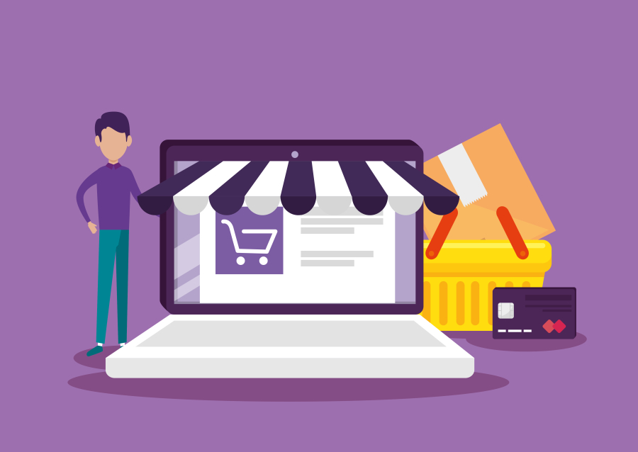
E-commerce Storefronts
Internal Tools for Enterprises
Educational Platforms and LMS
✅ Final Thoughts
Angular Material is a powerful UI toolkit that helps Angular developers create beautiful, consistent, and accessible user interfaces. Whether you're a freelancer building a dashboard for a client or a developer creating a large-scale application, Angular Material accelerates the process and improves the result.
At FreelancerBridge, we recommend Angular Material as a go-to solution for crafting professional and user-friendly interfaces. By following the best practices outlined here, you can ensure your UI stands out, performs well, and delights users—while saving development time and effort.


